Tuesday, 10 May 2011
Wednesday, 4 May 2011
Tuesday, 5 April 2011
Sunday, 3 April 2011
Poster : Technology
In terms of Software I have used :

Adobe Photoshop CS5

Adobe Flash CS5

Final Cut Pro

Adobe Dreamweaver CS5

Livetype
Microsoft Excel

Microsoft Word
Apple Iphoto
Websites and Online Technology that I have used:


Monday, 28 March 2011
Poster and Trailer Work : Fonts


Thursday, 17 March 2011
Audience Work : Screening
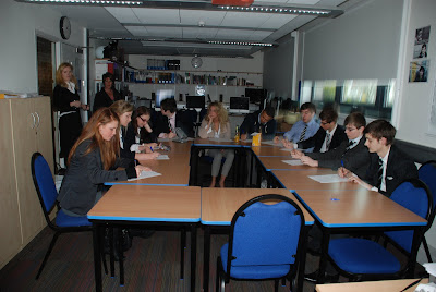
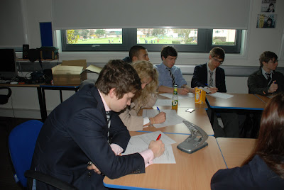
They conclusively said that the titles needed to remain on screen much longer and so I have edited it, so that the titles write themselves quicker and stay on screen longer, so this should hopefully please the audience, the re-edit has positive feedback on youtube. As well as this, some brightness issues were brought up, and they were dealt with instantly... and also some sound balancing issues which were improved.
Here is a Wordle of Words that were included by the focus group in the questionnaire, the larger the word is, the more times it was repeated. For example, interesting was one of the most common words used.
 What became clear from the focus group is that people around the age of 18 would usually go to to movie with their friends, but not alone which would suggest that it is a film that they are partially interested in, but would prefer to go with their friends. A majority of people said that they had friends who would go to this movie. The success within this age bracket is quite surprising, I was sort of aiming at a little higher, with a potential niche audience of older middle aged watchers.
Tuesday, 8 March 2011
Sunday, 6 March 2011
Question 1: In what ways does your media product use, develop or challenge forms and conventions of real media products : trailer pt. 1
The final basic convention of a trailer is that of the narrative, the narrative of my trailer is that of a kidnapping and the potential revenge. My trailer is shot in a low key way, in which the real action of the film is not shown, this being a convention of film that I am personally not keen on, I found that personally it would intrigue me more, if the ‘hook’ were a little more subtle. In terms of subtlety, I think that what I would have done, if it were allowed by the Exam Board, I would have gone for a trailer with a copyrighted song and the finished product would have more of a minimalist art-house feel such as the ‘Confessions’ Trailer , which even Hollywood Films like ‘The Social Network’ are aiming to mimic. However, my narrative is presented through intercutting to violent flashbacks like in the trailer for (and the movie itself) ‘Memento’, other aspects that are similar to that trailer are the displacement of narrative and the fact that nothing is in its natural order. The narrative also has a undetermined briefcase which is left as a mystery, both the films ‘Pulp Fiction’ and ‘Ronin’ used a briefcase as a crucial MacGuffin in their narrative.
Finally, as per usual, the links to the films mentioned above are below.
The Social Network http://www.youtube.com/watch?v=lB95KLmpLR4
Memento: http://www.youtube.com/watch?v=Rq9eM4ZXRgs
Confessions (Japanese, No subtitles): http://www.youtube.com/watch?v=p1gBAbI8UQQ
Pulp Fiction: http://www.youtube.com/watch?v=GFhadqrMPiU
Friday, 25 February 2011
Question 1: In what ways does your media product use, develop or challenge forms and conventions of real media products : trailer pt. 2
The next convention in a trailer is to establish a leading character/s. I believe that I did this well. Whilst my trailer is meant to be short, we are meant to get the impression that the Father is a ‘no-nonsense’ character, he is out to protect his daughter from those who have kidnapped her. This character is reminiscent of Liam Neeson’s character in ‘Taken’, however unlike Neeson’s character, he, from the trailer, appears to call assistance which would suggest he may be taking the law into his own hands similar to Michael Caine’s character in ‘Harry Brown’. The character archetype is deeply rooted in many 70s Vigilante/Crime movies such as Charles Bronson in ‘Death Wish’ and Clint Eastwood in ‘Dirty Harry’, hopefully an audience will recognise an attempt to hark back to this rapidly disappearing genre of movie (However, the various resurgences of this genre e.g. ‘Taken’ and ‘Old Boy’ have been wildly successful). The other aspect that he fits in with characters of this type is in his age, the character is meant to be around 40 - 55.The daughter, on the other hand, is tightly in-line with kidnapping victims in movies, she is blonde and wears clothes that denote that she is probably wealthy, films with characters similar to this are ‘Man on Fire’ and ‘Ransom’. However, my character is older than the usual character in a kidnap movie, usually the daughter is around 5-9 years old, whilst the daughter in my film is 15.
Once again, the links to all the film trailers mentioned above are below...
Taken: http://www.youtube.com/watch?v=CvUxdQ4q-Lg
Harry Brown: http://www.youtube.com/watch?v=I2S3SraFmI0
Death Wish: http://www.youtube.com/watch?v=_GieK_55uyY
Dirty Harry: http://www.youtube.com/watch?v=b6Ro0Wiq6v0
Old Boy: http://www.youtube.com/watch?v=YLn1y9v6yno
Man on Fire: http://www.youtube.com/watch?v=g4kLizDXLY0
Tuesday, 22 February 2011
Question 1: In what ways does your media product use, develop or challenge forms and conventions of real media products : trailer pt. 1
Certain conventions and clichés embed themselves in the collective mind of the audience, and in the following piece of writing, I will explain how my trailer strives to become reminiscent of, whilst not mimicking, trailers of the same genre.
Beyond the mere genre of the trailer, my trailer keeps to many of the key structural points of a trailer. Throughout the trailer, certain important aspects are established. In general, a trailer must simply outline the location, in my trailer, the location is established through the clearly British accents and the recognisable London suburbs. I chose not to really turn the fact that it is based in London, due to the fact that the plot is not really affected by the fact that it is set in London, in my trailer the location is apparent and not actively demonstrated. To be honest, whilst it is Film Convention to establish setting, in Thrillers, the concept behind them often needs to be strong enough that you could set the film anywhere. Due to the fact that Thrillers, Horrors and Action Movies are in their nature, High Concept e.g. The U.S. Remake of British TV Show, ‘State of Play’ as a Political Thriller movie and the (often line-for-line) remaking of Asian thrillers such as Korean romantic Thriller ‘Siworae’ as ‘the Lakehouse’ and Chinese Crime Thriller ‘Infernal Affairs’ as the ‘the Departed’. These are all examples of a plot transcending cultural barriers, and proof that the plot of a thriller far exceeds the necessity to associate a particular culture to it. Very often in thrillers, there is some form of criticism of certain social status, for example there is often criticism of Bourgeois culture which is an area of society that appears internationally and thus the criticism retains its strength worldwide. However in certain films, such as ‘127 Hours’, the setting does essentially define the film, it provides the real centre-point of the plot. There are also films that are specifically made to portray or critique a particular culture e.g. ‘City of God’, ‘Kidulthood’ and so-called American ‘Hood Films’. My product is aimed not to be specific to British culture, it is meant to create a plot that is recognisable to a multi-national audience.
This will be continued in another blog post. Links to all forementioned trailers are below.
- State of Play: http://www.youtube.com/watch?v=2ME87tEX9Qw
- Siworae/Il Mare: http://www.youtube.com/watch?v=fRe7E5GIq_M
- The Lake House: http://www.youtube.com/watch?v=V02lqEpbk2Y
- Infernal Affairs: http://www.youtube.com/watch?v=jO4RLrNVbd4
- The Departed: http://www.youtube.com/watch?v=SGWvwjZ0eDc
- 127 Hours: http://www.youtube.com/watch?v=OlhLOWTnVoQ
- City of God: http://www.youtube.com/watch?v=yJdW1TevoyA
- Kidulthood: http://www.youtube.com/watch?v=8vliupa-zi8
Thursday, 10 February 2011
Changes to the Plan
Thursday, 16 December 2010
Research and Planning : Sound

To be honest, sound is possibly the most difficult aspect of the trailer, it is very difficult to make my own music due to the fact that it is difficult to construct my own music for the project. I am currently looking at http://freeplaymusic.com/ because it has a large selection of copyright free music, however I do think that this website can be a little vague in terms of genre and sound on occasion.
As well as free sites like freeplaymusic, I looked at a site
that I am a member of,
 http://www.looperman.com/ which is based on the idea of creative commons and credited use and so if I were to use their tracks, I would have to credit them for their work and seeing as I have designed a slate, having more names to put in it could do no harm. So far, I have found a few tracks and a few artists that seem to be potential choices, I am already in contact with one of them due to a video I made outside school. So far, I have found the website to be easy to use, and I have decided that in the end the 3 categories from which potential tracks will come are Cinematic, Industrial or Metal because all three contain dark and heavy tracks that would suit the film. I am also planning to see if more electric tracks would fit with the trailer itself.
Here are a few URLs of good sounding potential music :
http://www.looperman.com/tracks_detail.php?tid=28588 (Some parts of this)
http://www.looperman.com/tracks_detail.php?tid=30432
http://www.looperman.com/tracks_detail.php?tid=11982
http://www.looperman.com/tracks_detail.php?tid=7915
Research and Planning : Titles, part 1.


Tuesday, 14 December 2010
Research and Planning : Idents


Monday, 13 December 2010
Recce - 3rd and 4th Shots.


 This final little alley way is once again, very close to my house and other locations that I will be filming at, unlike the areas I have looked at, this has significantly less space which might suggest less space for cameras, but at the same, it captures a more claustrophobic and tense scene, which could look better in a trailer, it gives a sense of pressure. As well as this, this area has more vegetation and appears a little more colourful on camera, to be honest this may be a negative thing, on the other hand, the area, if I am choosing to portray this as a meeting place arranged by the main character.
Tuesday, 30 November 2010
Recce - 1st and 2nd Shots.


 In my first shot, I thought this would be good because it is a secluded area around the back of a local football and near a substation, the walls are quite grimey and the bars and locks in the background look very foreboding and link to criminal activity and danger. In a way they are almost symbolic. As well as the sort of angle-shot that I would shoot from, I have included a picture of the locks and the door in detail. This location is good for several reasons: it looks good, it is within a kilometre of my house and thus is relatively easy for traveling to and finally it is not within in the vicinity of anyone's house and thus I will not be disturbing people when filming.
 I thought that this shot was good because it appears really wide and so there is a lot of space to film and yet at the same time, it feels quite compressed which helps give a good feel to the scene. I think this also looks good because it looks like it's a garage that could belong to the main characters friend. The garage doors alternating between vertical and horizon patterns, this looks quite nice in shot. I think it would look quite natural to film here as it seems like the kind of place people could meet one another. Again, this is reasonably close to my house although less secluded than the first location, being on an estate, I may have to ask people if I can film here, I do not know yet.
The 3rd and 4th Shots will go up soon.
Friday, 12 November 2010

Tuesday, 28 September 2010
Trailer Analysis : Harry Brown
The trailer to Harry Brown is a very good example of a revenge thriller trailer. The trailer is clever in the way that it genuinely does make you want to watch the movie. The Trailer begins with the problem, violent youths on a council estate being watched by Michael Caine as Harry Brown. Yes, it sets up a victim, Harry's friend Leonard at the beginning of the trailer. As well as this it sets up the situation where the main character makes a decision that he must attempt to right, like when he fails to think properly about protecting his friend and then exacts his vengeance on the youths. However it diverts from the usual plot of a revenge movie in the way that the Police are, by the looks of it, not condemning Harry for his vigilanteism, most revenge films choose to view revenge as more
Which trailer conventions does this trailer use well?
(voice over? / dramatic sound? /is it structured into 3 parts? /does it establish the genre ? how? /what audience do you think it is aiming at? )
Most of the trailer is dominated by sound-bites and voiceover that really give us the structure of the narrative, Michael Caine's voice is very well known and so this gives us a sense of familiarity to him and as well as this, he manages to convince me that his vengeance is justified. The sound used, includes violent noises and the trailer itself ends on the sound of a gunshot, this prepares us for a violent, modern urban film. I would say that the trailer is structured into probably 2 or 3 sections, the first being his friend feeling threatened and being killed, then the impression on Harry and him pondering whether he can just let his friend's killer go un-punished, and the final section (by the look of it much longer than the first two) him exacting his revenge. I believe that this trailer knows it has a huge audience, Michael Caine personally draws a large audience as one of the most respected British film-actors, this will appeal to older fans who know Caine, the idea of rowdy youth as well would suggest an older viewpoint of young society. As well as this it could be seen as a film for a younger audience as it is filled with action and violence and has a soundtrack of young urban music and the British rapper, Plan B, is a co-star in the film.
3) What are three moments or images or edits that you think are particularly effective in this trailer?
The images of the youth rioting in this street from an above angle in the dark makes it seem really ominous, this shot encapsulated the fear that Leonard felt before he died, the second image that really makes an impact is Michael Caine crying due to the fact that primarily he is a good actor and we can see how much this means to the character, Caine is also famous for playing tough characters and thus it is a strange image to see. The other is the finishing image of the trailer, where he points the gun at the screen and says ''You failed to maintain your weapon, Son.' which is the image that we are meant to be left with, thinking that he is fixed on revenge and nothing is going to prevent.
4) look at the studio idents - (what can you learn about idents and their style from these?)
The Lionsgate is the text LIONSGATE in block capitals it is black on a background of clouds in a sepia sky of clouds. They are quite interesting
Thursday, 9 September 2010
Trailer Analysis : Oldboy Trailer
The Oldboy trailer is a good example of a trailer that trys to appeal to a foreign audience. As a whole I don't think that it is a great trailer, but the movie was a huge international success. The first shot of the trailer remains unexplained adding mystery to the film. Then a selling point quickly pops up, "Winner of Grand Prix Festival of Cannes 2004", for many foreign films, it is quite difficult to sell them without the authenticity added by an award at a festival. We are then given some text with a distinctive font and a patterned background. Does not just tell the plot, shows it on screen. There is also a selective use of well-framed shots that show us the character as well as his surroundings. The trailer then changes to show our character having suffered, then action and revenge constitutes a change in the music. The trailer very much concentrates on our character 오대수 and I think it is quite clear that we are meant to view him as frustrated and obsessive by his behaviour and appearance. As it gets nearer the ending of the trailer,whilst flashing quotes from reviews to reinforce that it is infact a great movie, we get more of the impression of a tragic ending with the shots of the woman crying and our main character being beaten up. In this way, the trailer presents us with an outline of a story. Then the title comes up in a distinctive style of title.
Teaser Trailer Work : What is a Teaser Trailer?
6 Months before Trailer, they are between 30-90secs .
They aim to tease the audience.
They show the name, the date, the stars.
Best bits of the film, good framing, ACTION, PLOT etc.
Dragon Tattoo
Closeup Image, the date comes second.
More graphics.
Characters, Text.
Faster pace, few soundbites, not much explanation.
Establishing single-shot characters.
Location.
Series of shots that seemed to link a crime.
Violence shown, the punch.
Played with Fire
US Version, the titles are very good
Uses visual effects, ripples the titles, multiple colours and capitalisation ‘they FRAMED HER for MURDER’ emphasis
Hornet Nest
Focus on a character.
A little shot between titles, and the music
Actor’s names
Only a bit of action, not actually needed…
Visual impression,