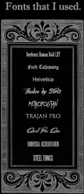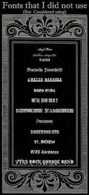

My aim with the fonts was to get a vaguely gothic font that appeared primarily creepy and mysterious, as opposed to action orientated.
MAIN TITLE
I decided that for the main title, I wanted a germanic/Old English font but with modern effects. An early favorite was "Deutsche Zierschrift", however it reacted badly to having effects such as 'bevel' applied to it, due to the fact that it was designed to look physically shaded. In the end I chose ''Faith Collapsing" over it, due to the fact that it looked better with editing than the other one. Also, its faded look made the title look more like dried blood which was a more effective look that just a gothic font.
NAME
Next to the title was my name, and to make this look effective, I wanted something that looked like a signature, in the end, I rejected "Bickham Script Pro" (No hyperlink, this font is pre-installed on Mac) on the grounds that it looked too much a font and not like a signature that I would have. I also rejected "Angel Tears", because it looked too much like the 'Coca Cola' Logo, which would look gimmicky. In the end, I chose the font "Quid Pro Quo" because of it's actual similarity to my handwriting, it made the poster look hand-signed. I wanted a level of personalisation, the Ben Rogers' gives the impression that it has been sent by me to the audience as a gift of sorts. I also did this because it reminded of directors like John Carpenter who put their name at the beginning of every title
BILLING BLOCK
When it comes to the billing block, there are two main fonts. I used both of them, but only one of them for the billing block. "Steel Tongs" appears on first glance to be more associated with action, whilst there is more subtlety in "Universal Accreditation". The reason for this is the fact that "Universal Accreditation" is slimmer and rounded slightly, whilst "Steel Tongs" is square and thick. As well as this, it, as a font is more versatile to editing, I was able to achieve a more metallic effect on the wrting than with "Steel Tongs". However, I did use "Steel Tongs" on the rating next to the 15 Certificate. As well as this, on the poster, next to the Billing block there were two little blocks of text, written in "Bordeaux Roman Bold LET" (Installed on Mac), I saw that on the internet this was considered a graphic design font and thought that if it was being recommended by the experts, I might as well use it, it works very well to the metallic effect I applied to it
OTHER FONTS USED
I used the remaining fonts on the award on the poster. Again two of these were described in a different article (here) as Professional, and I thought that Trajan had the Grandeur I was looking for when it came to writing 'Winner', it is a useful font. Helvetica (Installed on all computers) wasn't really used all that much, due to the fact that it is quite plain. I used Metropolitan for one of the Awards because it is an instantly recognisable movie font, and so Film Awards might choose to use it. Justice by Dirt2 is just used to write 2011, and it is a nice looking font I had installed.
No comments:
Post a Comment