Whilst I was constructing my poster, I came to the conclusion that it would show you my train of thought, if I was to upload a few of the many drafts of my poster. Currently my poster is yet to receive it's central image, which is a picture of the box itself rested upon a table, in darkness. Many of these looks are experiments and not all of them work, but each one helped me progress...
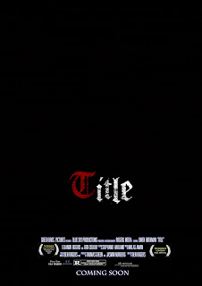
^ The first attempt to create the poster is very minimalist. ^
I used the word 'Title', instead of a title, whilst in development, so that I could display my font
The Awards are simple laurel jpegs found on the internet, as is the American R Rating
The Black background is not particularly adventurous, but then again, I was creating a very minimal outline of what the vague theme of the poster would be.
The colours and font have both stayed due to the fact that they are visually appealing.
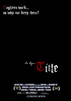 To be honest, the second poster is similar to the first, except I began to personalise the poster more. The inclusion of my name, 'Ben Rogers' Title' in a handwritten font serves to make me appear an important director in the same way that directors often label their work e.g. 'John Carpenter's The Thing' and 'Peter Jackson's King Kong'. As well as this inclusion of a tag-line area denoted by the fake tag-line in the top left corner. This poster served as a way of making the poster look better.
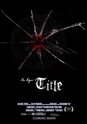 The third poster was an experimental idea, created around the same time as poster 2 and possibly previous to it, I decided to scrap the multi-coloured lettering presented in the other posters, for a singular white colouring, the big difference was the inclusion of some bloodied, cracked glass and a cultist symbol to both suggest a violent struggle and a conspiracy. As well as that, I was planning to use this effects on a photo of the daughter (my sister), which we also had out-takes from the filming of the photograph. This idea could have worked, had the clip been used, but sadly, I discarded the clip due to the fact that it was essentially quite difficult to fit into a teaser trailer
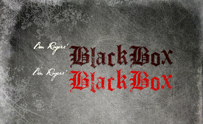
As I was ahead on my trailer work at this point, I needed to create a title and did so, the title 'Black Box' became my title, and using a filtered texture of granite, with a few, drawn flower drawings. I made the following... included in the image, is what the text would have looked like had I not used layers and filters to attain the appearance of dried blood.
 This background was very good and I decided that I would use it on my poster, so I copied the format of the trailer's title over to the poster and the best poster so far is the one below, which incorporates the best aspects of both.
 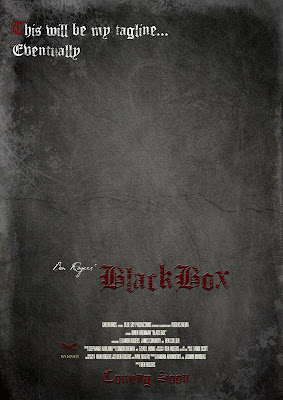 This poster has a nice background, the font looks like dried blood and looks quite gothic, this inclusion of my own film award, The 'Raven Film Festival' and a matching font for coming soon, are all things that make this poster look vastly improved. I am still having trouble with constructing a tag-line, due to the fact that to truly work, they often have to have clever wording or a pun of some sort and that sort of thing takes time to think of. Any way, I will soon upload the actual poster itself
No comments:
Post a Comment