 This is a draft of the final appearance of the website, though some of the levels have to be sorted and the youtube clip is not attached to it, and the links to facebook and potentially myspace are non-existent. It is designed off the aspects of the poster, that I have made previous to this. This tends to be the norm with websites, the poster design is in some way reformed and animated, but the general gist of it still remains.
Showing posts with label Planning. Show all posts
Showing posts with label Planning. Show all posts
Thursday, 31 March 2011
Website: Website draft
This is a draft of the final appearance of the website, though some of the levels have to be sorted and the youtube clip is not attached to it, and the links to facebook and potentially myspace are non-existent. It is designed off the aspects of the poster, that I have made previous to this. This tends to be the norm with websites, the poster design is in some way reformed and animated, but the general gist of it still remains.
Thursday, 17 March 2011
Poster : A few drafts and the up to date poster
Whilst I was constructing my poster, I came to the conclusion that it would show you my train of thought, if I was to upload a few of the many drafts of my poster. Currently my poster is yet to receive it's central image, which is a picture of the box itself rested upon a table, in darkness. Many of these looks are experiments and not all of them work, but each one helped me progress...
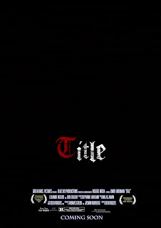
^ The first attempt to create the poster is very minimalist. ^
I used the word 'Title', instead of a title, whilst in development, so that I could display my font
The Awards are simple laurel jpegs found on the internet, as is the American R Rating
The Black background is not particularly adventurous, but then again, I was creating a very minimal outline of what the vague theme of the poster would be.
The colours and font have both stayed due to the fact that they are visually appealing.
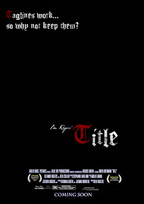 To be honest, the second poster is similar to the first, except I began to personalise the poster more. The inclusion of my name, 'Ben Rogers' Title' in a handwritten font serves to make me appear an important director in the same way that directors often label their work e.g. 'John Carpenter's The Thing' and 'Peter Jackson's King Kong'. As well as this inclusion of a tag-line area denoted by the fake tag-line in the top left corner. This poster served as a way of making the poster look better.
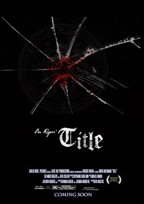 The third poster was an experimental idea, created around the same time as poster 2 and possibly previous to it, I decided to scrap the multi-coloured lettering presented in the other posters, for a singular white colouring, the big difference was the inclusion of some bloodied, cracked glass and a cultist symbol to both suggest a violent struggle and a conspiracy. As well as that, I was planning to use this effects on a photo of the daughter (my sister), which we also had out-takes from the filming of the photograph. This idea could have worked, had the clip been used, but sadly, I discarded the clip due to the fact that it was essentially quite difficult to fit into a teaser trailer
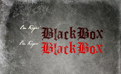
As I was ahead on my trailer work at this point, I needed to create a title and did so, the title 'Black Box' became my title, and using a filtered texture of granite, with a few, drawn flower drawings. I made the following... included in the image, is what the text would have looked like had I not used layers and filters to attain the appearance of dried blood.
 This background was very good and I decided that I would use it on my poster, so I copied the format of the trailer's title over to the poster and the best poster so far is the one below, which incorporates the best aspects of both.
 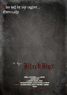 This poster has a nice background, the font looks like dried blood and looks quite gothic, this inclusion of my own film award, The 'Raven Film Festival' and a matching font for coming soon, are all things that make this poster look vastly improved. I am still having trouble with constructing a tag-line, due to the fact that to truly work, they often have to have clever wording or a pun of some sort and that sort of thing takes time to think of. Any way, I will soon upload the actual poster itself
Thursday, 10 February 2011
Changes to the Plan
Due to the fact that my original plan was somewhat dull and unambitious, I have felt the need, rather late on, to revamp this project. Various changes have been made to the narrative, actors, general concept and length of trailer.
First, the narrative seemed boring, yet unachievable. The amount of actors needed and the nature of the action scene, meant that most of the shots would have ended up as an incomprehensible mess. What was originally a regular married couple with a daughter, seemed a poor idea, because they are not the sort of people who would be attacked. The idea of a random attack limited the plot and drove the narrative nowhere, it made the villains faceless and unremarkable. The general plot was blunt and predictable, the trailer appeared to lead nowhere, outlining little of the plot, without creating the required mystery, there was no Unique Selling Point. Nothing made this story watchable. I have now improved aspects of this trailer, to encompass the single father and his daughter, the attack is not planned and is even forewarned with the case sent to the house. There is now a mystery in the plot, about the father and his connections, the item in the briefcase and why they have kidnapped his daughter. Also the kidnap of the daughter as opposed to the murder, means that I have more motive to go after the villains and it spares me having to make what would be undoubtedly a poor death scene, something that is frankly impossible for a student to produce. The briefcase also adds a face to the villain/s.
In terms of actors, the characters that I had, external to the main three, whom I have kept, would honestly have distracted us from the main plot of the film. The role of the mum and Dad's friend were actually just a waste of time, and due to the fact that I am incurably awful at finding actors, I set myself the job of finding these actors, when I could have just got on with filming. I changed the father from being some awful Dulwich dad into being a character who potentially had connections to criminals, because it was implausible that he would be able to take revenge otherwise. Also the daughter has changed from an aggressive character, to a more regular character, the reason for this change is that it was a needless subplot, and subplot has no place in a thriller trailer. The dad's friend, again was a character who I had no actors for, I don't know anyone who lives in this country who could play this part.
The General concept of the trailer has changed, it is no longer quite the revenge trailer it was, because I realised that movies of this sort aren't made on the budget that I have, and also they are a genre generally more associated with huge actors e.g. Michael Caine, Liam Neeson or even action movie guys, whom I don't know, thus basing it on a formula that it is not associated with amateur/newcomer British cinematography. I have decided to make it more of a plain thriller, with aspects of mystery. The idea of action movie aspects, when I don't have the use of after effects, basically means what I film will look awful. I need to make it a bit more low-key and a bit more subtle and symbolic, less physical and blatant.
As well as this, the final aspect that needed a review is the timing of the trailer, the montage idea did not suit the pace of the trailer that I have decided on. The timing of the first scene was really slow and seemed to hark back to last year's opening scene task, and thus I needed more pace and at the same time far less. So I decided to create a mysterious trailer by intercutting multiple scenes at the same time as opposed to playing a straight scene which will bore the audiences senseless. As well as this, it will allow me to cover up the limitations that I have as a student, without intercutting, a kidnap scene would look poor, but flashing action at an audience will really pump them up as opposed to showing them the action, thus removing the element of surprise that audiences really want when they go to the cinema.
As you can see, I was incredibly critical of my original trailer-concept and thought I would somewhat obliterate it, to show my thought process, one of the reasons I wasted so much time is that I passionately wanted to make an original trailer, and I did not want to make the one that I had first thougt up, because it was bad.
Friday, 14 January 2011
Audience Research : Opinions on movies
At this moment in time, my initial survey has had 39 replies and this allows me to analyze a wider audience to see potentially which audiences are interested in my film.
Gender
56.4% of replies were from Males, 43.6% from Females
There was little to no real difference in tastes in movie from the audience selection
Age
We have had
Under 16s: 3
16-25: 7
26-35: 8
36-45: 12
46-55:9
So, as a whole, I have a range of statistics from the everywhere from Under 16 to 55
Genre
As a whole, the most popular genre was Comedy, which 13 Votes / 33.3% of people ranked in their top 3, however my trailer fits, potentially, into Thriller and Action which received 11 Votes/ 28.2%, both at joint third behind Drama. The definite popularity of these two genres is reassuring to me, showing that there is a large potential audience
I also chose to put a second Audience question about Genre that would help expose what audiences thought about each other. My question was "My reasoning behind this question is that it would potentially help me see whether I was latching onto a niche audience or whether I could capture the Mainstream audience, however there was anoter motive behind this question, to discover whether audiences felt un-catered for, for example Andy answered my questionaire and said that he believed that people his age's tastes were 'less diverse' and this opinionof his was probably triggered by the fact that the films aimed at people of his age range (36-45) did not contain enough 'Action' and 'Arthouse', the two forms of film that he specifically mentioned. So essentially, in theory there is an untapped audience, there was an overwhelming 1/3 of people answering my survey stating that they felt that many people their age enjoyed Drama, when they themselves enjoyed Action and Thrillers.
Regularity
The regularity with which people visited the Cinema showed that a resoundingly large figure of 56.4% of people visited the Cinema twice monthly, this would suggest to me that people go and see films pretty consistently and this may suggest that people aren't too picky about going to see films and they, due to the regularity of their schedule, might want to go and see something odd. The 7.7% of people who go 3-4 times a month, and the 2.6% who goes weekly or more, would in my opinion go to the film sheerly because they enjoy the cinema experience or they are very interested in film, at which point they would be willing to go and see up coming directors.
As well as this, the quantity of DVDs bought per month is quite staggering, with a vaste majority of people buying, renting or downloading films, 2 or more times a month, this probably means, unless my audience are incredibly wealthy, the price of the DVD on release should be low, because with low-budget films, there is no way that you can ask for a large price, and people will be much more likely to take a risk buying a new director's film if it costs £5 than if it costs £16-20
Effective Methods of Advertising
Conclusively people ticked the box for 'Word of Mouth' 69.2% of the time and Reviews 56.4% of the time, no-one who filled in the survey did not fill in either of these two boxes, which means that these are the two most effective ways of advertising to people, other than perhaps the Trailer itself. Suggestions as to where they got their information were places such as: Rottentomatoes.com (3), Mark Kermode and Simon Mayo (3) , Empire Magazine (1), The Guardian (8), The Metro (1), Youtube (3), facebook (2), Time Out (3), Twitter (1), Observer (1) and the New York Times (1). This showed that actually newspaper and radio were still an effective way of reaching the audience and people still trust written review over youtube, facebook or twitter.
What people look for in a film
This was one of the few questions where there was a spread of answers with over 10% of people voting for each diffent section; 'Famous Director, Famous Cast, Storyline, Genre, Trailer and Nominations' - However Storyline won conclusively with 41% of the vote with Trailer and Nominations both as 15% or so, however if you think about it a Trailer is meant to express a storyline and show nominations and reviews, so I took that trailer is actually the most important way of demonstrating the aspect in question
Thursday, 16 December 2010
Research and Planning : Sound

To be honest, sound is possibly the most difficult aspect of the trailer, it is very difficult to make my own music due to the fact that it is difficult to construct my own music for the project. I am currently looking at http://freeplaymusic.com/ because it has a large selection of copyright free music, however I do think that this website can be a little vague in terms of genre and sound on occasion.
As well as free sites like freeplaymusic, I looked at a site
that I am a member of,
 http://www.looperman.com/ which is based on the idea of creative commons and credited use and so if I were to use their tracks, I would have to credit them for their work and seeing as I have designed a slate, having more names to put in it could do no harm. So far, I have found a few tracks and a few artists that seem to be potential choices, I am already in contact with one of them due to a video I made outside school. So far, I have found the website to be easy to use, and I have decided that in the end the 3 categories from which potential tracks will come are Cinematic, Industrial or Metal because all three contain dark and heavy tracks that would suit the film. I am also planning to see if more electric tracks would fit with the trailer itself.
Here are a few URLs of good sounding potential music :
http://www.looperman.com/tracks_detail.php?tid=28588 (Some parts of this)
http://www.looperman.com/tracks_detail.php?tid=30432
http://www.looperman.com/tracks_detail.php?tid=11982
http://www.looperman.com/tracks_detail.php?tid=7915
Research and Planning : Titles, part 1.
I have decided on a temporary title and have been applying various effects to titles to make them look intriguing and not boring, the name of my film is currently 'ABSOLUTION', despite the religious undertones of the term, I think the word has connections with contemplation, redemption and potential revenge. As well as this, there may potentially be a church scene in the montage scene. These titles are the first simplistic design for graphics, I will soon be posting a collection of fonts that are possibilities. These are mainly simple filter jobs on Photoshop Creative Studio 3, but they show three clearly dissimilar concepts.


Tuesday, 14 December 2010
Research and Planning : Idents
First of all I searched for independent idents that looked reasonably professional and attempted to notice trends in the industry, I noticed that essentially one of most recurring factors in idents is the stationary logo. Many independent film companies have stationary logos central to the screen, and the more high budget company has a full screen animation. So, to begin to work on making a low budget ident. Below are examples of independent logos that are prime examples.


As you can see, they often have a 'boxed' image with text below, the image is often quite simplistic and preferably quite bizarre and memorable , sometimes they are connected to the film, e.g. (A high-budget example) the color changes and additions to the Warner Bros. logo in the Matrix or Harry Potter an often film companies that make certain kinds of film have logos that relate to the genre of film i.e. a thriller will not be made by a company that is represented by a cartoon bunny.
My first ident is designed to look like an independent studio. It has a stationary image that is
meant to look like some sort of scientific cell, the name 'Green Bros.' is both a pun on the idea of the Warner Bros. name and is also an anagram of my name. The colour of the logo is
of course, green. The image is meant to look like a green cell, there is no real reason for this other than it looks good on screen and does not disrupt from the mood of the trailer, in fact I would say that it retains it's own dark qualities. However, it does contrast from the general colour scheme of the trailer which is mainly going to be slightly greyscale footage and reddish maroon titles.
Monday, 13 December 2010
Recce - 3rd and 4th Shots.


Shot 3
I thought that this shot had an intriguing aspect to it, the angles of the walls all avoid strict 90 degree angles and I think that this makes the shot look sort of off. The arch under which someone could easily stand would make a good meeting place for two characters. I think as well that the shade and colour of the bricks (particularly in the first photograph.) are not too colourful and thus allow the shot to appear drained of colour and thus perfect for the idea of grieving and the negative themes of the film. I think it would be easy to film nice shots here, and it easy to travel here, but I may have to ask the permission of local resident.


 This final little alley way is once again, very close to my house and other locations that I will be filming at, unlike the areas I have looked at, this has significantly less space which might suggest less space for cameras, but at the same, it captures a more claustrophobic and tense scene, which could look better in a trailer, it gives a sense of pressure. As well as this, this area has more vegetation and appears a little more colourful on camera, to be honest this may be a negative thing, on the other hand, the area, if I am choosing to portray this as a meeting place arranged by the main character.
SHOT 4


 This final little alley way is once again, very close to my house and other locations that I will be filming at, unlike the areas I have looked at, this has significantly less space which might suggest less space for cameras, but at the same, it captures a more claustrophobic and tense scene, which could look better in a trailer, it gives a sense of pressure. As well as this, this area has more vegetation and appears a little more colourful on camera, to be honest this may be a negative thing, on the other hand, the area, if I am choosing to portray this as a meeting place arranged by the main character.
Wednesday, 1 December 2010
Research and Planning : My Trailer Animatic.
As well as making a storyboard, I scanned it in and made an 'animatic' from the original frames, I chose some temporary music and used a temporary font for the title, it is in no way perfect, but it is a vague overview of the order of my trailer.
Tuesday, 30 November 2010
Recce - 1st and 2nd Shots.
I went on a photographic recce over the weekend to a collection of places in the area that I could potentially film a few outside scenes, my aim was to find either run-down areas or shabby built-up areas. In the scene, where the main character meets his 'shifty' friend and I chose areas that are inconspicuous, because I thought these would be the best place for the characters to meet secretly.


 In my first shot, I thought this would be good because it is a secluded area around the back of a local football and near a substation, the walls are quite grimey and the bars and locks in the background look very foreboding and link to criminal activity and danger. In a way they are almost symbolic. As well as the sort of angle-shot that I would shoot from, I have included a picture of the locks and the door in detail. This location is good for several reasons: it looks good, it is within a kilometre of my house and thus is relatively easy for traveling to and finally it is not within in the vicinity of anyone's house and thus I will not be disturbing people when filming.

 I thought that this shot was good because it appears really wide and so there is a lot of space to film and yet at the same time, it feels quite compressed which helps give a good feel to the scene. I think this also looks good because it looks like it's a garage that could belong to the main characters friend. The garage doors alternating between vertical and horizon patterns, this looks quite nice in shot. I think it would look quite natural to film here as it seems like the kind of place people could meet one another. Again, this is reasonably close to my house although less secluded than the first location, being on an estate, I may have to ask people if I can film here, I do not know yet.
The 3rd and 4th Shots will go up soon.
SHOT 1


 In my first shot, I thought this would be good because it is a secluded area around the back of a local football and near a substation, the walls are quite grimey and the bars and locks in the background look very foreboding and link to criminal activity and danger. In a way they are almost symbolic. As well as the sort of angle-shot that I would shoot from, I have included a picture of the locks and the door in detail. This location is good for several reasons: it looks good, it is within a kilometre of my house and thus is relatively easy for traveling to and finally it is not within in the vicinity of anyone's house and thus I will not be disturbing people when filming.
SHOT 2

 I thought that this shot was good because it appears really wide and so there is a lot of space to film and yet at the same time, it feels quite compressed which helps give a good feel to the scene. I think this also looks good because it looks like it's a garage that could belong to the main characters friend. The garage doors alternating between vertical and horizon patterns, this looks quite nice in shot. I think it would look quite natural to film here as it seems like the kind of place people could meet one another. Again, this is reasonably close to my house although less secluded than the first location, being on an estate, I may have to ask people if I can film here, I do not know yet.
The 3rd and 4th Shots will go up soon.
Friday, 12 November 2010

Thursday, 4 November 2010
The Conventions of the genre of Revenge thrillers and trailers. My trailer and how it will fit with aforementioned conventions.
The main aspects of the revenge thriller are the first (and probably most important) scene, which will consist of an event that will ‘drive’ our character’s behaviour to beyond what we are expecting. This will usually involve an injustice being committed against our character e.g. a murder, a framing. Before this scene we will usually have character development but in a trailer, we are usual given some form of overview of this in a voiceover or small clip, this is done effectively in the Harry Brown trailer when his friend tells him that he fears for his life. This often adds some sense of moral duty for our character, and will later motivate his revenge. However these scenes do not provide the action that many of the potential audience will be looking for, that is why these sections must be short but effective, that is one of the reasons that some trailers use sound-bites. The first major scene takes up the largest section of the trailer, the aim is to capture the entire build-up and the main action, and the end result in the trailer is to use the entire scene of the ‘point-of-no-return’ or at least the main action because it is undoubtedly the most crucial scene, it is central to the plot. Also it contains the action that the audience will want to see.
The second section serves as a sort of contemplation scene, where the character is contemplating potential possibilities of what he must do, an inner conflict must be present both physically on screen as well as in some sort of sound-bite that will convey how unsure he is of what to do next. The other thing to do is to have an external source of advice e.g. a friend (in my case possibly a father) who shows him a way of thinking that inspires him to take justice into his own hands. These sections are often set in churches, graveyards and areas that are quite solitary, due to the mourning there is often an extended family involved.
The third section is the main section of the film, yet however much of this is not shown, there is a montage flashed of images that show violence and action, this is the clincher the bits that the audience do not see everything they want to see. The music always picks up pace quite rapidly and ends with a bang with an important shot and then the title and that thing that always come after the title with the cast and crew. It is important to give a massive build up that shows what the audience wants. Guns, fights, redemption, perhaps a message, a definitive bad guy etc. and finally some sort of shot that will stick solidly in the minds of the audience e.g. a twist, a selling point. The title itself should have a memorable font but not too over-the-top because that would end up making the film look less serious.
Subscribe to:
Posts (Atom)