 This is a draft of the final appearance of the website, though some of the levels have to be sorted and the youtube clip is not attached to it, and the links to facebook and potentially myspace are non-existent. It is designed off the aspects of the poster, that I have made previous to this. This tends to be the norm with websites, the poster design is in some way reformed and animated, but the general gist of it still remains.
Thursday, 31 March 2011
Website: Website draft
This is a draft of the final appearance of the website, though some of the levels have to be sorted and the youtube clip is not attached to it, and the links to facebook and potentially myspace are non-existent. It is designed off the aspects of the poster, that I have made previous to this. This tends to be the norm with websites, the poster design is in some way reformed and animated, but the general gist of it still remains.
Wednesday, 30 March 2011
Poster : Conventions of a Teaser Poster
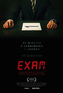
There are no actors shown in this poster.
Only a 'high concept' idea of a plot
It also chooses to highlight that it was on the 'Official Selection' for Edinburgh Film Festival
In fact, many teaser posters don't show actors, just mere symbols representing the characters or plot points. The Black Box itself is the central image of my poster, what it does is highlight the fact that the Black Box is a mysterious object. Below are a few posters that use objects to connote certain things
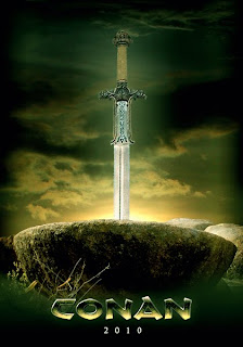
This poster for Conan (yet to be made) , for example contain a giant sword, which would suggest a great warrior or hero, in the same way that the Black Box would suggest mystery. However as well as this...
 There are posters that lure you in with a brand, for example, this new up-to-date 'Batman' poster which shows the painted nails and tattoo associated with the character Harley Quinn, whilst my poster cannot quite do this, it can at least advertise using it's name. The name 'Black Box' and the image 'Black Box' are easy to associate.
Here are a list of conventions that I believe that my poster sticks to:
1)There is a general colour code throughout the poster, of greys, blacks and reds
2)Bold title in a colour that contrasts the background colour, and compliments the look of the poster, whilst standing out.
3) One dominating central image, either representing Mystery (in mine), Action, Conflict or Love
4) A particular font that re-occurs all over the poster. In my case 'Faith Collapsing'


Monday, 28 March 2011
Poster and Trailer Work : Fonts


My aim with the fonts was to get a vaguely gothic font that appeared primarily creepy and mysterious, as opposed to action orientated.
MAIN TITLE
I decided that for the main title, I wanted a germanic/Old English font but with modern effects. An early favorite was "Deutsche Zierschrift", however it reacted badly to having effects such as 'bevel' applied to it, due to the fact that it was designed to look physically shaded. In the end I chose ''Faith Collapsing" over it, due to the fact that it looked better with editing than the other one. Also, its faded look made the title look more like dried blood which was a more effective look that just a gothic font.
NAME
Next to the title was my name, and to make this look effective, I wanted something that looked like a signature, in the end, I rejected "Bickham Script Pro" (No hyperlink, this font is pre-installed on Mac) on the grounds that it looked too much a font and not like a signature that I would have. I also rejected "Angel Tears", because it looked too much like the 'Coca Cola' Logo, which would look gimmicky. In the end, I chose the font "Quid Pro Quo" because of it's actual similarity to my handwriting, it made the poster look hand-signed. I wanted a level of personalisation, the Ben Rogers' gives the impression that it has been sent by me to the audience as a gift of sorts. I also did this because it reminded of directors like John Carpenter who put their name at the beginning of every title
BILLING BLOCK
When it comes to the billing block, there are two main fonts. I used both of them, but only one of them for the billing block. "Steel Tongs" appears on first glance to be more associated with action, whilst there is more subtlety in "Universal Accreditation". The reason for this is the fact that "Universal Accreditation" is slimmer and rounded slightly, whilst "Steel Tongs" is square and thick. As well as this, it, as a font is more versatile to editing, I was able to achieve a more metallic effect on the wrting than with "Steel Tongs". However, I did use "Steel Tongs" on the rating next to the 15 Certificate. As well as this, on the poster, next to the Billing block there were two little blocks of text, written in "Bordeaux Roman Bold LET" (Installed on Mac), I saw that on the internet this was considered a graphic design font and thought that if it was being recommended by the experts, I might as well use it, it works very well to the metallic effect I applied to it
OTHER FONTS USED
I used the remaining fonts on the award on the poster. Again two of these were described in a different article (here) as Professional, and I thought that Trajan had the Grandeur I was looking for when it came to writing 'Winner', it is a useful font. Helvetica (Installed on all computers) wasn't really used all that much, due to the fact that it is quite plain. I used Metropolitan for one of the Awards because it is an instantly recognisable movie font, and so Film Awards might choose to use it. Justice by Dirt2 is just used to write 2011, and it is a nice looking font I had installed.
Thursday, 17 March 2011
Poster : A few drafts and the up to date poster
Whilst I was constructing my poster, I came to the conclusion that it would show you my train of thought, if I was to upload a few of the many drafts of my poster. Currently my poster is yet to receive it's central image, which is a picture of the box itself rested upon a table, in darkness. Many of these looks are experiments and not all of them work, but each one helped me progress...
^ The first attempt to create the poster is very minimalist. ^
I used the word 'Title', instead of a title, whilst in development, so that I could display my font
The Awards are simple laurel jpegs found on the internet, as is the American R Rating
The Black background is not particularly adventurous, but then again, I was creating a very minimal outline of what the vague theme of the poster would be.
The colours and font have both stayed due to the fact that they are visually appealing.
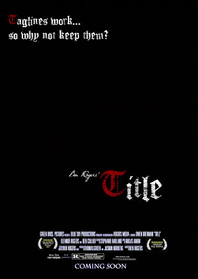 To be honest, the second poster is similar to the first, except I began to personalise the poster more. The inclusion of my name, 'Ben Rogers' Title' in a handwritten font serves to make me appear an important director in the same way that directors often label their work e.g. 'John Carpenter's The Thing' and 'Peter Jackson's King Kong'. As well as this inclusion of a tag-line area denoted by the fake tag-line in the top left corner. This poster served as a way of making the poster look better.
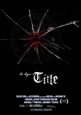 The third poster was an experimental idea, created around the same time as poster 2 and possibly previous to it, I decided to scrap the multi-coloured lettering presented in the other posters, for a singular white colouring, the big difference was the inclusion of some bloodied, cracked glass and a cultist symbol to both suggest a violent struggle and a conspiracy. As well as that, I was planning to use this effects on a photo of the daughter (my sister), which we also had out-takes from the filming of the photograph. This idea could have worked, had the clip been used, but sadly, I discarded the clip due to the fact that it was essentially quite difficult to fit into a teaser trailer
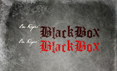
As I was ahead on my trailer work at this point, I needed to create a title and did so, the title 'Black Box' became my title, and using a filtered texture of granite, with a few, drawn flower drawings. I made the following... included in the image, is what the text would have looked like had I not used layers and filters to attain the appearance of dried blood.
 This background was very good and I decided that I would use it on my poster, so I copied the format of the trailer's title over to the poster and the best poster so far is the one below, which incorporates the best aspects of both.
 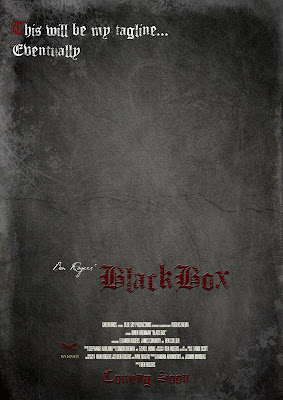 This poster has a nice background, the font looks like dried blood and looks quite gothic, this inclusion of my own film award, The 'Raven Film Festival' and a matching font for coming soon, are all things that make this poster look vastly improved. I am still having trouble with constructing a tag-line, due to the fact that to truly work, they often have to have clever wording or a pun of some sort and that sort of thing takes time to think of. Any way, I will soon upload the actual poster itself
Audience Work : Screening
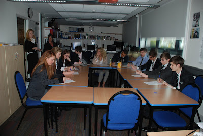
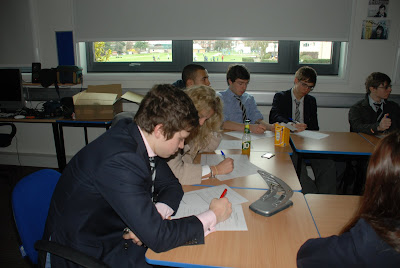
At long last, I have finally shown my trailer to an audience of twelve people as well as, potentially, an upcoming online audience via. youtube and facebook. Here are some pictures of my screening...
From this short questionnaire given to my audience, I have learnt what I need to do and I have already re-cut the trailer to accommodate some of the ideas that were put forward, certain issues were difficult to change, and so some things remain unchanged, but then again, no product is perfect. Underneath are my findings from the questionnaire. As well as this, I will make a Wordle of words (I assume this is the way you refer to a Wordle) out of the summaries put forward by the group.
As a whole, the focus group came back with some pretty solid recommendations.
They conclusively said that the titles needed to remain on screen much longer and so I have edited it, so that the titles write themselves quicker and stay on screen longer, so this should hopefully please the audience, the re-edit has positive feedback on youtube. As well as this, some brightness issues were brought up, and they were dealt with instantly... and also some sound balancing issues which were improved.
Here is a Wordle of Words that were included by the focus group in the questionnaire, the larger the word is, the more times it was repeated. For example, interesting was one of the most common words used.
 What became clear from the focus group is that people around the age of 18 would usually go to to movie with their friends, but not alone which would suggest that it is a film that they are partially interested in, but would prefer to go with their friends. A majority of people said that they had friends who would go to this movie. The success within this age bracket is quite surprising, I was sort of aiming at a little higher, with a potential niche audience of older middle aged watchers.
Tuesday, 8 March 2011
Sunday, 6 March 2011
Question 1: In what ways does your media product use, develop or challenge forms and conventions of real media products : trailer pt. 1
The final basic convention of a trailer is that of the narrative, the narrative of my trailer is that of a kidnapping and the potential revenge. My trailer is shot in a low key way, in which the real action of the film is not shown, this being a convention of film that I am personally not keen on, I found that personally it would intrigue me more, if the ‘hook’ were a little more subtle. In terms of subtlety, I think that what I would have done, if it were allowed by the Exam Board, I would have gone for a trailer with a copyrighted song and the finished product would have more of a minimalist art-house feel such as the ‘Confessions’ Trailer , which even Hollywood Films like ‘The Social Network’ are aiming to mimic. However, my narrative is presented through intercutting to violent flashbacks like in the trailer for (and the movie itself) ‘Memento’, other aspects that are similar to that trailer are the displacement of narrative and the fact that nothing is in its natural order. The narrative also has a undetermined briefcase which is left as a mystery, both the films ‘Pulp Fiction’ and ‘Ronin’ used a briefcase as a crucial MacGuffin in their narrative.
Finally, as per usual, the links to the films mentioned above are below.
The Social Network http://www.youtube.com/watch?v=lB95KLmpLR4
Memento: http://www.youtube.com/watch?v=Rq9eM4ZXRgs
Confessions (Japanese, No subtitles): http://www.youtube.com/watch?v=p1gBAbI8UQQ
Pulp Fiction: http://www.youtube.com/watch?v=GFhadqrMPiU
Subscribe to:
Posts (Atom)