Tuesday, 10 May 2011
Wednesday, 4 May 2011
Tuesday, 5 April 2011

Monday, 4 April 2011
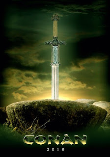
Website : Conventions of a Film Website
 The second thing that the eye is drawn to is the title. This is always a recognisable font, admittedly Avatar's font is the subject of controversy, due to the fact that it is a 'cheap' font installed on Mac and PC called 'Papyrus' and many fans were distressed at the use of such a cheap font for such an expensive movie. However it noticeable among the market to have a font associated with your film, for example, films like TRON and the Godfather have their fonts mimicked in many things, yet people will always associate the font with the film.My film uses 'Faith Collapsing' font which doesn't have any real associations, meaning that my film can stand alone with it's own font.
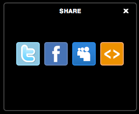 The next important aspect of a page is the importance of networking and word of mouth, there must be someway of your website encouraging people to share it among themselves. Websites like facebook, rotten tomatoes and myspace have sites for individual movies that people can 'like', which in itself, makes the movie look more popular and also the reaction of one person to seeing that their friend enjoys a movie, is often to go. My survey, pre-making any of my projects, suggested that people listen to friends' 'word of mouth' more than any form of advertising. So having symbols associated with, and linking to these 'social networks' can only increase success.
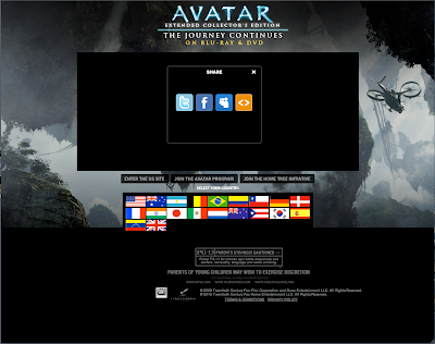
 One of the final, mainly visual aspects of film website is the background, often comprised of parts of the poster or of the film itself, depending on the suitability of the footage and whether the colour scheme works. I presume that this one for Avatar, is an unreleased poster or just a freeze frame from the film (which is probably much easier to get in a film that it almost entirely HD animation). Mine is just the poster but horizontal with a section of shadow in the centre to emphasize the Text in the middle and to generally make it smoother.
Sunday, 3 April 2011
Poster : Technology
In terms of Software I have used :

Adobe Photoshop CS5

Adobe Flash CS5

Final Cut Pro

Adobe Dreamweaver CS5

Livetype
Microsoft Excel

Microsoft Word
Apple Iphoto
Websites and Online Technology that I have used:


Thursday, 31 March 2011
Website: Website draft
 This is a draft of the final appearance of the website, though some of the levels have to be sorted and the youtube clip is not attached to it, and the links to facebook and potentially myspace are non-existent. It is designed off the aspects of the poster, that I have made previous to this. This tends to be the norm with websites, the poster design is in some way reformed and animated, but the general gist of it still remains.
Wednesday, 30 March 2011
Poster : Conventions of a Teaser Poster
 There are posters that lure you in with a brand, for example, this new up-to-date 'Batman' poster which shows the painted nails and tattoo associated with the character Harley Quinn, whilst my poster cannot quite do this, it can at least advertise using it's name. The name 'Black Box' and the image 'Black Box' are easy to associate.
Here are a list of conventions that I believe that my poster sticks to:
1)There is a general colour code throughout the poster, of greys, blacks and reds
2)Bold title in a colour that contrasts the background colour, and compliments the look of the poster, whilst standing out.
3) One dominating central image, either representing Mystery (in mine), Action, Conflict or Love
4) A particular font that re-occurs all over the poster. In my case 'Faith Collapsing'


Monday, 28 March 2011
Poster and Trailer Work : Fonts


Thursday, 17 March 2011
Poster : A few drafts and the up to date poster
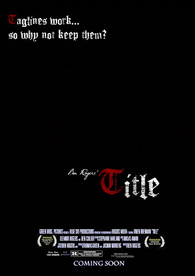 To be honest, the second poster is similar to the first, except I began to personalise the poster more. The inclusion of my name, 'Ben Rogers' Title' in a handwritten font serves to make me appear an important director in the same way that directors often label their work e.g. 'John Carpenter's The Thing' and 'Peter Jackson's King Kong'. As well as this inclusion of a tag-line area denoted by the fake tag-line in the top left corner. This poster served as a way of making the poster look better.
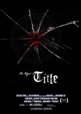 The third poster was an experimental idea, created around the same time as poster 2 and possibly previous to it, I decided to scrap the multi-coloured lettering presented in the other posters, for a singular white colouring, the big difference was the inclusion of some bloodied, cracked glass and a cultist symbol to both suggest a violent struggle and a conspiracy. As well as that, I was planning to use this effects on a photo of the daughter (my sister), which we also had out-takes from the filming of the photograph. This idea could have worked, had the clip been used, but sadly, I discarded the clip due to the fact that it was essentially quite difficult to fit into a teaser trailer
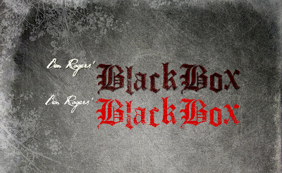 This background was very good and I decided that I would use it on my poster, so I copied the format of the trailer's title over to the poster and the best poster so far is the one below, which incorporates the best aspects of both.
 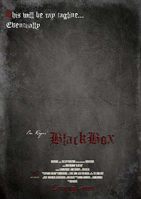 This poster has a nice background, the font looks like dried blood and looks quite gothic, this inclusion of my own film award, The 'Raven Film Festival' and a matching font for coming soon, are all things that make this poster look vastly improved. I am still having trouble with constructing a tag-line, due to the fact that to truly work, they often have to have clever wording or a pun of some sort and that sort of thing takes time to think of. Any way, I will soon upload the actual poster itself
Audience Work : Screening
They conclusively said that the titles needed to remain on screen much longer and so I have edited it, so that the titles write themselves quicker and stay on screen longer, so this should hopefully please the audience, the re-edit has positive feedback on youtube. As well as this, some brightness issues were brought up, and they were dealt with instantly... and also some sound balancing issues which were improved.
Here is a Wordle of Words that were included by the focus group in the questionnaire, the larger the word is, the more times it was repeated. For example, interesting was one of the most common words used.
 What became clear from the focus group is that people around the age of 18 would usually go to to movie with their friends, but not alone which would suggest that it is a film that they are partially interested in, but would prefer to go with their friends. A majority of people said that they had friends who would go to this movie. The success within this age bracket is quite surprising, I was sort of aiming at a little higher, with a potential niche audience of older middle aged watchers.
Tuesday, 8 March 2011
Sunday, 6 March 2011
Question 1: In what ways does your media product use, develop or challenge forms and conventions of real media products : trailer pt. 1
The final basic convention of a trailer is that of the narrative, the narrative of my trailer is that of a kidnapping and the potential revenge. My trailer is shot in a low key way, in which the real action of the film is not shown, this being a convention of film that I am personally not keen on, I found that personally it would intrigue me more, if the ‘hook’ were a little more subtle. In terms of subtlety, I think that what I would have done, if it were allowed by the Exam Board, I would have gone for a trailer with a copyrighted song and the finished product would have more of a minimalist art-house feel such as the ‘Confessions’ Trailer , which even Hollywood Films like ‘The Social Network’ are aiming to mimic. However, my narrative is presented through intercutting to violent flashbacks like in the trailer for (and the movie itself) ‘Memento’, other aspects that are similar to that trailer are the displacement of narrative and the fact that nothing is in its natural order. The narrative also has a undetermined briefcase which is left as a mystery, both the films ‘Pulp Fiction’ and ‘Ronin’ used a briefcase as a crucial MacGuffin in their narrative.
Finally, as per usual, the links to the films mentioned above are below.
The Social Network http://www.youtube.com/watch?v=lB95KLmpLR4
Memento: http://www.youtube.com/watch?v=Rq9eM4ZXRgs
Confessions (Japanese, No subtitles): http://www.youtube.com/watch?v=p1gBAbI8UQQ
Pulp Fiction: http://www.youtube.com/watch?v=GFhadqrMPiU
Friday, 25 February 2011
Question 1: In what ways does your media product use, develop or challenge forms and conventions of real media products : trailer pt. 2
The next convention in a trailer is to establish a leading character/s. I believe that I did this well. Whilst my trailer is meant to be short, we are meant to get the impression that the Father is a ‘no-nonsense’ character, he is out to protect his daughter from those who have kidnapped her. This character is reminiscent of Liam Neeson’s character in ‘Taken’, however unlike Neeson’s character, he, from the trailer, appears to call assistance which would suggest he may be taking the law into his own hands similar to Michael Caine’s character in ‘Harry Brown’. The character archetype is deeply rooted in many 70s Vigilante/Crime movies such as Charles Bronson in ‘Death Wish’ and Clint Eastwood in ‘Dirty Harry’, hopefully an audience will recognise an attempt to hark back to this rapidly disappearing genre of movie (However, the various resurgences of this genre e.g. ‘Taken’ and ‘Old Boy’ have been wildly successful). The other aspect that he fits in with characters of this type is in his age, the character is meant to be around 40 - 55.The daughter, on the other hand, is tightly in-line with kidnapping victims in movies, she is blonde and wears clothes that denote that she is probably wealthy, films with characters similar to this are ‘Man on Fire’ and ‘Ransom’. However, my character is older than the usual character in a kidnap movie, usually the daughter is around 5-9 years old, whilst the daughter in my film is 15.
Once again, the links to all the film trailers mentioned above are below...
Taken: http://www.youtube.com/watch?v=CvUxdQ4q-Lg
Harry Brown: http://www.youtube.com/watch?v=I2S3SraFmI0
Death Wish: http://www.youtube.com/watch?v=_GieK_55uyY
Dirty Harry: http://www.youtube.com/watch?v=b6Ro0Wiq6v0
Old Boy: http://www.youtube.com/watch?v=YLn1y9v6yno
Man on Fire: http://www.youtube.com/watch?v=g4kLizDXLY0
Tuesday, 22 February 2011
Question 1: In what ways does your media product use, develop or challenge forms and conventions of real media products : trailer pt. 1
Certain conventions and clichés embed themselves in the collective mind of the audience, and in the following piece of writing, I will explain how my trailer strives to become reminiscent of, whilst not mimicking, trailers of the same genre.
Beyond the mere genre of the trailer, my trailer keeps to many of the key structural points of a trailer. Throughout the trailer, certain important aspects are established. In general, a trailer must simply outline the location, in my trailer, the location is established through the clearly British accents and the recognisable London suburbs. I chose not to really turn the fact that it is based in London, due to the fact that the plot is not really affected by the fact that it is set in London, in my trailer the location is apparent and not actively demonstrated. To be honest, whilst it is Film Convention to establish setting, in Thrillers, the concept behind them often needs to be strong enough that you could set the film anywhere. Due to the fact that Thrillers, Horrors and Action Movies are in their nature, High Concept e.g. The U.S. Remake of British TV Show, ‘State of Play’ as a Political Thriller movie and the (often line-for-line) remaking of Asian thrillers such as Korean romantic Thriller ‘Siworae’ as ‘the Lakehouse’ and Chinese Crime Thriller ‘Infernal Affairs’ as the ‘the Departed’. These are all examples of a plot transcending cultural barriers, and proof that the plot of a thriller far exceeds the necessity to associate a particular culture to it. Very often in thrillers, there is some form of criticism of certain social status, for example there is often criticism of Bourgeois culture which is an area of society that appears internationally and thus the criticism retains its strength worldwide. However in certain films, such as ‘127 Hours’, the setting does essentially define the film, it provides the real centre-point of the plot. There are also films that are specifically made to portray or critique a particular culture e.g. ‘City of God’, ‘Kidulthood’ and so-called American ‘Hood Films’. My product is aimed not to be specific to British culture, it is meant to create a plot that is recognisable to a multi-national audience.
This will be continued in another blog post. Links to all forementioned trailers are below.
- State of Play: http://www.youtube.com/watch?v=2ME87tEX9Qw
- Siworae/Il Mare: http://www.youtube.com/watch?v=fRe7E5GIq_M
- The Lake House: http://www.youtube.com/watch?v=V02lqEpbk2Y
- Infernal Affairs: http://www.youtube.com/watch?v=jO4RLrNVbd4
- The Departed: http://www.youtube.com/watch?v=SGWvwjZ0eDc
- 127 Hours: http://www.youtube.com/watch?v=OlhLOWTnVoQ
- City of God: http://www.youtube.com/watch?v=yJdW1TevoyA
- Kidulthood: http://www.youtube.com/watch?v=8vliupa-zi8
Thursday, 10 February 2011
Changes to the Plan
Friday, 14 January 2011
Audience Research : Opinions on movies
Gender
56.4% of replies were from Males, 43.6% from Females
There was little to no real difference in tastes in movie from the audience selection
Age
We have had
Under 16s: 3
16-25: 7
26-35: 8
36-45: 12
46-55:9
So, as a whole, I have a range of statistics from the everywhere from Under 16 to 55
Genre
As a whole, the most popular genre was Comedy, which 13 Votes / 33.3% of people ranked in their top 3, however my trailer fits, potentially, into Thriller and Action which received 11 Votes/ 28.2%, both at joint third behind Drama. The definite popularity of these two genres is reassuring to me, showing that there is a large potential audience
I also chose to put a second Audience question about Genre that would help expose what audiences thought about each other. My question was "My reasoning behind this question is that it would potentially help me see whether I was latching onto a niche audience or whether I could capture the Mainstream audience, however there was anoter motive behind this question, to discover whether audiences felt un-catered for, for example Andy answered my questionaire and said that he believed that people his age's tastes were 'less diverse' and this opinionof his was probably triggered by the fact that the films aimed at people of his age range (36-45) did not contain enough 'Action' and 'Arthouse', the two forms of film that he specifically mentioned. So essentially, in theory there is an untapped audience, there was an overwhelming 1/3 of people answering my survey stating that they felt that many people their age enjoyed Drama, when they themselves enjoyed Action and Thrillers.
Regularity
The regularity with which people visited the Cinema showed that a resoundingly large figure of 56.4% of people visited the Cinema twice monthly, this would suggest to me that people go and see films pretty consistently and this may suggest that people aren't too picky about going to see films and they, due to the regularity of their schedule, might want to go and see something odd. The 7.7% of people who go 3-4 times a month, and the 2.6% who goes weekly or more, would in my opinion go to the film sheerly because they enjoy the cinema experience or they are very interested in film, at which point they would be willing to go and see up coming directors.
As well as this, the quantity of DVDs bought per month is quite staggering, with a vaste majority of people buying, renting or downloading films, 2 or more times a month, this probably means, unless my audience are incredibly wealthy, the price of the DVD on release should be low, because with low-budget films, there is no way that you can ask for a large price, and people will be much more likely to take a risk buying a new director's film if it costs £5 than if it costs £16-20
Effective Methods of Advertising
Conclusively people ticked the box for 'Word of Mouth' 69.2% of the time and Reviews 56.4% of the time, no-one who filled in the survey did not fill in either of these two boxes, which means that these are the two most effective ways of advertising to people, other than perhaps the Trailer itself. Suggestions as to where they got their information were places such as: Rottentomatoes.com (3), Mark Kermode and Simon Mayo (3) , Empire Magazine (1), The Guardian (8), The Metro (1), Youtube (3), facebook (2), Time Out (3), Twitter (1), Observer (1) and the New York Times (1). This showed that actually newspaper and radio were still an effective way of reaching the audience and people still trust written review over youtube, facebook or twitter.
What people look for in a film
This was one of the few questions where there was a spread of answers with over 10% of people voting for each diffent section; 'Famous Director, Famous Cast, Storyline, Genre, Trailer and Nominations' - However Storyline won conclusively with 41% of the vote with Trailer and Nominations both as 15% or so, however if you think about it a Trailer is meant to express a storyline and show nominations and reviews, so I took that trailer is actually the most important way of demonstrating the aspect in question
Wednesday, 12 January 2011
Poster Work: Gone Baby Gone
