
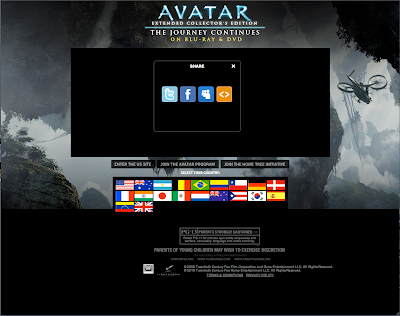
the picture above is a picture of the website in working order
 The second thing that the eye is drawn to is the title. This is always a recognisable font, admittedly Avatar's font is the subject of controversy, due to the fact that it is a 'cheap' font installed on Mac and PC called 'Papyrus' and many fans were distressed at the use of such a cheap font for such an expensive movie. However it noticeable among the market to have a font associated with your film, for example, films like TRON and the Godfather have their fonts mimicked in many things, yet people will always associate the font with the film.My film uses 'Faith Collapsing' font which doesn't have any real associations, meaning that my film can stand alone with it's own font.
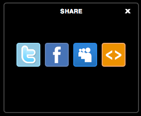 The next important aspect of a page is the importance of networking and word of mouth, there must be someway of your website encouraging people to share it among themselves. Websites like facebook, rotten tomatoes and myspace have sites for individual movies that people can 'like', which in itself, makes the movie look more popular and also the reaction of one person to seeing that their friend enjoys a movie, is often to go. My survey, pre-making any of my projects, suggested that people listen to friends' 'word of mouth' more than any form of advertising. So having symbols associated with, and linking to these 'social networks' can only increase success.
 One of the final, mainly visual aspects of film website is the background, often comprised of parts of the poster or of the film itself, depending on the suitability of the footage and whether the colour scheme works. I presume that this one for Avatar, is an unreleased poster or just a freeze frame from the film (which is probably much easier to get in a film that it almost entirely HD animation). Mine is just the poster but horizontal with a section of shadow in the centre to emphasize the Text in the middle and to generally make it smoother.


 This is a draft of the final appearance of the website, though some of the levels have to be sorted and the youtube clip is not attached to it, and the links to facebook and potentially myspace are non-existent. It is designed off the aspects of the poster, that I have made previous to this. This tends to be the norm with websites, the poster design is in some way reformed and animated, but the general gist of it still remains.
 There are posters that lure you in with a brand, for example, this new up-to-date 'Batman' poster which shows the painted nails and tattoo associated with the character Harley Quinn, whilst my poster cannot quite do this, it can at least advertise using it's name. The name 'Black Box' and the image 'Black Box' are easy to associate.
